Tutorial 4a: Nonlinear regression
This tutorial was generated from an IPython notebook. You can download the notebook here.
In this tutorial, we will learn some techniques in nonlinear regression. For the most part, this is still just a parameter estimation problem like we've done in the last couple of weeks. Most of what today covers are technical nuances on how to compute properties about the posterior distribution describing parameter values.
We define by $\mathbf{a}_i$ the set of parameters under model $M_i$. Then, our posterior is $P(\mathbf{a}_i~|~D,M_i,I)$.
Since we will not be doing model selection until Tutorial 4b, we will drop the $i$ subscript for this tutorial and will not explicity say that we are using model $M_i$, defining our posterior as $P(\mathbf{a}~|~D,I)$.
The data sets
We will again be using the spindle length data set from the Good, et al. paper. You can download the data set here. We will analyze those data at the end of this tutorial.
First, we will use a data set from Angela Stathopoulos's lab, acquired to study morphogen profiles in developing fruit fly embryos. The original paper is Reeves, Trisnadi, et al., Dorsal-ventral gene expression in the Drosophila embryo reflects the dynamics and precision of the Dorsal nuclear gradient, Dev. Cell., 22, 544-557, 2012, and the data set may be downloaded here.
In this experiment, Reeves, Trisnadi, and coworkers measured expression levels of a fusion of Dorsal, a morphogen transcription factor important in determining the dorsal-ventral axis of the developing organism, and Venus, a yellow fluorescent protein along the dorsal/ventral- (DV) coordinate. They put this construct on the third chromosome, where the wild type dorsal is on the second. Instead of the wild type, they had a homozygous dorsal-null mutant on the second chromosome. The Dorsal-Venus construct rescues wild type behavior, so they could use this construct to study Dorsal gradients. We will investigate verification of this rescue in Tutorial 4b.
Dorsal shows higher expression on the ventral side of the organism, thus giving a gradient in expression from dorsal to ventral which can be ascertained by the spatial distribution of Venus fluorescence intensity.
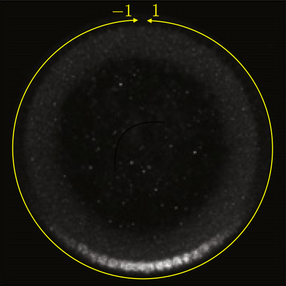
This can be seen in the image below, which is a cross section of a fixed embryo with anti-Dorsal staining. The bottom of the image is the ventral side and the top is the dorsal side of the embryo. The DV coordinate system is defined by the yellow line. It is periodic, going from $-1$ to $1$. The DV-coordinate is therefore defined in relative terms around the embryo and is dimensionless. The ventral nuclei show much higher expression of Dorsal. The image is adapted from the Reeves, Trisnadi, et al. paper.
A quick note on nomenclature: Dorsal (capital D) is the name of the protein product of the gene dorsal (italicized). The dorsal (adjective) side of the embryo is its back. The ventral side is its belly. Dorsal is expressed more strongly on the ventral side of the developing embryo. This can be confusing.
To quantify the gradient, Reeves, Trisnadi, and coworkers had to first choose a metric for describing it. They chose to fit the measured profile of fluorescence intensity with a Gaussian (plus background) and use the standard deviation of that Gaussian as a metric for the width of the Dorsal gradient. This provides a nice motivation for doing nonlinear regression.
Necessary modules
Before we begin, as usual, we will import out modules. If you have not installed emcee, you will need to do that using pip. You should also install triangle. Its name in Canopy (and if you're using pip) is triangle_plot. Beware: triangle is some other module entirely! You will also need some functions I have written for you (in the file jb_utils.py), which you can download here.
from __future__ import division, absolute_import, \
                                    print_function, unicode_literals

import numpy as np
import matplotlib.pyplot as plt
import pandas as pd
import scipy.special
import scipy.optimize

# Uncomment the next line if you haven't yet installed emcee
# !pip install emcee
import emcee

# Uncomment the next line if you haven't yet installed triangle
# !pip install triangle_plot
import triangle

from brewer2mpl import sequential
import numdifftools as nd

# Utilities from JB
import jb_utils as jb

# Necessary to display plots in this IPython notebook
%matplotlib inline
Nonlinear regression of the Reeves, Trisnadi, et al. data
We will perform regressions on the Reeves, Trisnadi, et al. data first. The first data set contains the measured level of fluorescence intensity coming from the Dorsal-Venus construct at different stages of development. Development in the Drosophila embryo is times based on nuclear cycles, the number of nuclear divisions that have happened. Prior to cellularization of the syncytium, there are 14 rounds of nuclear division. Reeves, Trisnadi, et al. measured Dorsal-Venus expression at nuclear cycle 11, 12, 13, and 14.
Loading the data set
# Load the nuclear Venus fluorescence intensity levels into a DataFrame
df = pd.read_csv('../data/reeves_et_al/reeves_dv_profile_over_time.csv',
                 comment='#')

# Take a look
df.head()
It is nice to have descriptive column headings, but, as usually, we will rename them for convenience.
# Rename with short, easy names
df.columns = ['dv14', 'f14', 'dv13', 'f13', 'dv12', 'f12', 'dv11', 'f11']
Let's plot the profiles to get a feel for how they look. In this case, including lines connecting points helps to visualize the chapes of the curves.
# Loop through and plot each profile
for i in ['11', '12', '13', '14']:
    # Sort so the lines don't get messed up while plotting
    plot_df = df[['dv' + i, 'f' + i]].dropna().sort('dv' + i)

    # Label of line (makes for easy legend making)
    label = 'nc ' + i

    # Generate plot
    plt.plot(plot_df['dv'+i], plot_df['f'+i], '.-', label=label)

# Label axes
plt.xlabel('DV coordinate')
plt.ylabel('fluor. int. (a.u.)')

# Add legend
plt.legend(numpoints=1)
Model function for the regression
To perform the regression, we of course need to know what model function to fit. Reeves, et al. propsed using a Gaussian curve, plus background, to describe the profiles. Strictly speaking, a Gaussian is not periodic, and these data are periodic, so we should fit a periodic function. The periodic version of the Gaussian distribution is a Von Mises distribution,
\begin{align} P(\theta~|~\mu,\beta) = \frac{\mathrm{e}^{\beta\cos(\theta - \mu)}}{2\pi I_0(\beta)}, \end{align}
where $\theta \in (0,2\pi]$ and $I_0(s)$ is a modified Bessel function. The parameter $\beta$ is analogous to $1/\sigma^2$ in a Gaussian, and $\mu$ is of course analogous to $\mu$. To use the Von Mises distribution to fit these data, we would make the change of variables $x = \theta/\pi - 1$ (where $x$ is the DV coordinate) giving
\begin{align} P(x~|~\mu,\beta) = \frac{\mathrm{e}^{\beta\cos(\pi(x - \mu))}}{2 I_0(\beta)}. \end{align}
However, because the Gaussian decays away far before the dorsal side, a Gaussian is for all purposes periodic. In fact, when $\sigma$ is much smaller than the total domain size, the two distributions are almost the same, as we can see by plotting them.
# Set up x for plotting
x = np.linspace(-np.pi, np.pi, 200)

# Set sigma to 1/20 of total domain size
sigma = np.pi / 10.0

# Compute Von Mises and Gaussian
beta = 1.0 / sigma**2
von_mises = np.exp(beta * np.cos(x)) / (2.0 * np.pi * scipy.special.i0(beta))
gaussian = np.exp(-x**2 / 2.0 / sigma**2) / np.sqrt(2.0 * np.pi * sigma**2)

# Plot the results
plt.plot(x, gaussian, 'k-', label='Gaussian')
plt.plot(x, von_mises, 'c.', label='Von Mises')
plt.xlabel(r'$\theta$')
plt.ylabel(r'P($\theta$)')
plt.legend(loc='upper left', numpoints=3)
So, we will follow the paper and use a Gaussian plus background to fit the data. (Note: the authors were aware of this periodicity issue and commented on it in their paper; they were being careful!) The standard deviation can then be a metric for gradient width. The equation is
\begin{align} F(x; a, b, \mu, \sigma) = a + b \exp\left\{-\frac{(x - \mu)^2}{2\sigma^2}\right\}, \end{align}
where $a$ is the background, $b$ sets the arbitrary scale of the $y$-axis, $\mu$ is the location of the center of the peak, and $\sigma$ describes the width of the peak. We use $F$ to stand for fluoresence intensity.
It is important not to confuse ourselves here. We should perhaps call the above equation our "peak equation," avoiding use of the term "Gaussian." We are not implying that the fluorescent intensity if somehow Gaussian distributed in space. It is merely peaked, and this functional form is a convenient way to describe the peak.
Defining the likelihood
In our regression, we will assume that each nucleus has a fluorescent intensity that is drawn from a process that gives Gaussian distributed intensities in accordance the central limit theorem. So as not to confuse notation, we will call the (unknown) variance of this process $\sigma_F$ (we usually call it $\sigma$).
We will also assume that the parameters $a$ and $b$ are not the same from on experiment to another, possibly due to different levels of photobleaching prior to each experiment.
With all this in hand, we can write our likelihood.
\begin{align} P(D~|~a, b, \mu, \sigma,\sigma_I, I) &= \prod_{i\in D}\frac{1}{\sqrt{2\pi\sigma_F^2}}\, \exp\left\{-\frac{\left(F_i - F(x_i;a,b,\mu,\sigma)\right)^2}{2\sigma_F^2}\right\} \\ &= \prod_{i\in D}\frac{1}{\sqrt{2\pi\sigma_F^2}}\, \exp\left\{-\frac{1}{2\sigma_F^2}\left(F_i - a - b \,\mathrm{e}^{-(x_i - \mu)^2/2\sigma^2}\right)^2\right\} \end{align}
The prior
We will assume the five parameters are independent, so the prior is the product of their respective priors. As usual, we will assume a Jeffreys prior on $\sigma_F$. We will assume a uniform prior on $\mu$, noting that $-1 < \mu \le 1$. We will also assume uniform priors on $a$ and $b$, noting that $a,b > 0$. Finally, we will assume a uniform prior on $\sigma$. Why not a Jeffreys prior? A Jeffreys prior is not necessarily inappropriate, but because we are on a finite domain and $\sigma$ is describing a well-defined width of a gradient, we do not wish to enforce symmetry proprerty of $P(\sigma < 1 ~|~I) = P(\sigma > 1~|~I)$, which is where the Jeffreys prior comes from.
The posterior
We can now write the log posterior.
\begin{align} \ln P(a,b,\mu,\sigma,\sigma_I) = \text{constant} - (n+1)\ln \sigma_F -\frac{1}{2\sigma_F^2}\sum_{i\in D} \left(F_i - a - b \,\mathrm{e}^{-(x_i - \mu)^2/2\sigma^2}\right)^2 \end{align}
Regression for nuclear cycle 14
We see from the functional form that $\sigma_F$ will not influence the most probable values of $a$, $b$, $\mu$, and $\sigma$. We can then use scipy.optimize.curve_fit to find the most probable parameters. In this way, there is really no difference in how we do linear versus nonlinear regression. We will perform the regression for nuclear cycle 14 as our first example.
# Define function for curve_fit
def fit_fun(x, a, b, mu, sigma):
    """
    Fit function for our "peak function" for morphogen profile.
    """
    return a + b * np.exp(-(x - mu)**2 / 2.0 / sigma**2)

# Initial guess
a = 1.0
b = 5.0
mu = 0.0
sigma = 0.5
p0 = np.array([a, b, mu, sigma])

# Find the most probable parameter values
popt, junk_output = scipy.optimize.curve_fit(
        fit_fun, df.dv14.dropna(), df.f14.dropna(), p0)

# Unpack and report result
a, b, mu, sigma = popt
print("""Most probable parameter values:
a     =  {0:.3f}
b     =  {1:.3f}
mu    = {2:.3f}
sigma =  {3:.3f}""".format(a, b, mu, sigma))
To compute the error bars on the parameters, we take the same strategy we did with estimation of a single parameter. We approximate the posterior locally as a Gaussian. To do this, we would need to include $\sigma_F$ in our posterior. We can take a short cut around this by directly marginalizing $\sigma_F$ and using the marginalized posterior
\begin{align} P(a,b,\mu,\sigma~|~D,I) = \int_0^\infty \mathrm{d}\sigma_F \, P(a,b,\mu,\sigma,\sigma_F~|~D,I). \end{align}
I will not go through the details of this integral here (they are given in section 8.2 of Sivia), but the resulting marginalized log posterior is
\begin{align} \ln P(a,b,\mu,\sigma~|~D,I) = \text{constant} -\frac{n}{2}\ln\left(\sum_{i\in D} \left(I_i - a - b \,\mathrm{e}^{-(x_i - \mu)^2/2\sigma^2}\right)^2\right). \end{align}
With this marginalized log posterior in hand, we can compute the error bars on $a$, $b$, $\mu$, and $\sigma$.
The Gaussian approximation is now multidimensional. We define $\mathbf{a} = (a, b, \mu,\sigma)^\mathsf{T}$ as a vector containing our parameters. Then, the multi-dimensional Taylor series expansion of the (marginalized) log posterior about the most probable parameters, $\mathbf{a}^*$, is, to second order,
\begin{align} L \equiv \ln P(\mathbf{a}~|~D,I) \approx \text{constant} + \frac{1}{2}(\mathbf{a} - \mathbf{a}^*)^\mathsf{T} \cdot \mathsf{H} \cdot (\mathbf{a} - \mathbf{a}^*), \end{align}
where $\mathsf{H} = \nabla \nabla \ln P$ is the Hessian of the log posterior at its maximum. The Hessian is the matrix of partial second derivatives. In this case,
\begin{align} \mathsf{H} = \begin{pmatrix} \frac{\partial^2 L}{\partial a^2} & \frac{\partial^2 L}{\partial a \partial b} & \frac{\partial^2 L}{\partial a \partial \mu} & \frac{\partial^2 L}{\partial a \partial \sigma} \\[2mm] \frac{\partial^2 L}{\partial b \partial a} & \frac{\partial^2 L}{\partial b^2} & \frac{\partial^2 L}{\partial b \partial \mu} & \frac{\partial^2 L}{\partial b \partial \sigma} \\[2mm] \frac{\partial^2 L}{\partial \mu \partial a} & \frac{\partial^2 L}{\partial \mu \partial b} & \frac{\partial^2 L}{\partial \mu^2} & \frac{\partial^2 L}{\partial \mu \partial \sigma} \\[2mm] \frac{\partial^2 L}{\partial \sigma \partial a} & \frac{\partial^2 L}{\partial \sigma \partial b} & \frac{\partial^2 L}{\partial \sigma \partial \mu} & \frac{\partial^2 L}{\partial \sigma^2} \end{pmatrix}, \end{align}
where the second derivatives are evaluated as $\mathbf{a} = \mathbf{a}^*$. The Hessian is obviously symmetric, and because it is computed at $\mathbf{a}^*$, it is negative definite. This means that its inverse exists. We can therefore write the covariance matrix as
\begin{align} \mathsf{\sigma}_\mathrm{cov}^2 = -\mathsf{H}^{-1}, \end{align}
which is postive definite. (Normally, we would just call this $\mathsf{\sigma}$, but we already have a variable named $\sigma$ here, so we will use $\mathsf{\sigma}_\mathrm{cov}$.) Properly computing the normalization constant, the approximate posterior is then
\begin{align} P(\mathbf{a}~|~D,I) = \frac{1}{\sqrt{(2\pi)^4 \det \mathsf{\sigma}_\mathrm{cov}^2}}\,\exp\left\{-\frac{1}{2}(\mathbf{a} - \mathbf{a}^*)^\mathsf{T}\cdot (\sigma_\mathrm{cov}^2)^{-1}\cdot (\mathbf{a} - \mathbf{a}^*)\right\}. \end{align}
We see that the covariance matrix is analogous to the variance in the one-dimensional case. Note that the fourth power in the normalization constant is specific to this example (four parameters).
We will again use numdifftools to compute the Hessian of the log posterior and then also the covariance. The square root of the diagonal entries of the covariance give the error bars on the parameters.
Because of the way numdifftools accepts arguments, I wrote a convenience function to compute the Hessian. This is jb.hess_nd.
With this in hand, we can compute the Hessian and invert it to get the covariance matrix.
# Define the marginalized log posterior
def log_marg_posterior(p, x, fl):
    """
    Log of posterior for Gaussian model of fluorescent intensity profile
    along DV-axis.  This is given up to an additive constant for a given
    sigma_I.

    Assumes uniform priors for all parameters.
    """
    return -len(x) / 2.0 * np.log(((fl - fit_fun(x, *p))**2).sum())

# Compute Hessian
hess = jb.hess_nd(log_marg_posterior, popt,
                  (df.dv14.dropna(), df.f14.dropna()))

# Compute the covariance (negative inverse of Hessian)
cov = -np.linalg.inv(hess)
Now that we have our covariance matrix, we can report our error bars.
# Compute errors
a_err, b_err, mu_err, sigma_err = np.sqrt(np.diag(cov))

# Report results
print("""Most probable parameter values:
a =     {0:.3f} += {4:.3f}
b =     {1:.3f} += {5:.3f}
mu =   {2:.3f} += {6:.3f}
sigma = {3:.3f} += {7:.3f}""".format(
                a, b, mu, sigma, a_err, b_err, mu_err, sigma_err))
If we wanted to plot the posterior distribution as a function of two parameters (which is the maximum we can visualize), we would have to marginalize over the remaining parameters. This can lead to messy (though in this specific case tractable) integrals to do the marginalization. For this purpose, MCMC is an easier method.
Doing all the regressions
We can now proceed to compute the Dorsal gradient width for the other nuclear cycles.
# Use same initial guesses for all
a = 1.0
b = 5.0
mu = 0.0
sigma = 0.5
p0 = np.array([a, b, mu, sigma])

popts = []
errs = []

# Loop through each stage
for i in ['11', '12', '13', '14']:
    # Pull out x and y values to fit
    x = df['dv' + i].dropna()
    y = df['f' + i].dropna()

    # Find the most probable parameter values
    popt, junk_output = scipy.optimize.curve_fit(fit_fun, x, y, p0)

    # Compute the covariance matrix
    hess = jb.hess_nd(log_marg_posterior, popt, (x, y))
    cov = -np.linalg.inv(hess)

    # Compute error bars
    err = np.sqrt(np.diag(cov))

    # Append results in our list
    popts.append(popt)
    errs.append(err)

    # Print results to screen
    print('NC {0:s}: sigma = {1:.3f} +- {2:.3f}'.format(
                                                i, popt[-1], err[-1]))
We see what we expected from eyeballing the plots; all widths are about the same. Let's plot our regression results along with the data.
# Generate smooth x coordinate for plotting curve fits
x = np.linspace(-1.0, 1.0, 200)

# Get a list of nice ColorBrewer colors
# (I don't like to use lightest colors, hence choosing 6 instead of 4)
bmap = sequential.BuPu[6]

# Loop through and plot each profile
for j, i in enumerate(['11', '12', '13', '14']):
    # Label of line (makes for easy legend making)
    label = 'nc ' + i

    # Generate plot of points
    plt.plot(df['dv'+i], df['f'+i], '.', label=label, zorder=1,
             color=bmap.mpl_colors[j+2])

    # Generate smooth plot
    y = fit_fun(x, *popts[j])
    plt.plot(x, y, '-', color=bmap.mpl_colors[j+2], zorder=0)

# Label axes
plt.xlabel('DV coordinate')
plt.ylabel('fluor. int. (a.u.)')

# Add legend
plt.legend(numpoints=1)
Nonlinear regression of the Good, et al. data
Recall from last time that we were considering two different theoretical models for the spindle length vs. droplet size data presented in Good, et al.
Model 1
In Model 1, the spindle size is independent of droplet size. The corresponding equation is
\begin{align} l = \theta. \end{align}
Model 2
We define by Model 2 the full relation between spindle length and droplet diameter,
\begin{align} l(d;\gamma,\theta) \approx \frac{\gamma d}{\left(1+(\gamma d/\theta)^3\right)^{\frac{1}{3}}}. \end{align}
We will perform a nonlinear regression of Model 2 to the Good, et al. data. We will consider all data, not just the points where $ d < 90$ µm. The procedure is very much like the Reeves, Trisnadi, et al. example, so we just proceed with the code.
# Load data into DataFrame
df = pd.read_csv('../data/good_et_al/invitro_droplet_data.csv',
                 comment='#')

# Rename columns
df.columns = ['droplet_diameter', 'droplet_volume', 'spindle_length',
              'spindle_width', 'spindle_area']

# Define fit function
def good_fit_fun(d, gamma, theta):
    """
    Theoretical model for spindle length dependence on droplet diameter
    """
    return gamma * d / scipy.special.cbrt(1.0 + (gamma * d / theta)**3)

# Define marginalized log of posterior
def good_log_marg_posterior(p, d, ell):
    """
    Log of posterior for spindle length up to additive constant.

    Assumes uniform priors for all parameters.
    """
    return -len(d) / 2.0 * np.log(((ell - good_fit_fun(d, *p))**2).sum())

# Initial guess
gamma_0 = 0.5
theta_0 = 50.0  # microns
p0 = np.array([gamma_0, theta_0])

# Find most probable parameters
popt, junk_output = scipy.optimize.curve_fit(
            good_fit_fun, df.droplet_diameter, df.spindle_length, p0)

# Compute covariance
hess = jb.hess_nd(good_log_marg_posterior, popt,
                  (df.droplet_diameter, df.spindle_length))
cov = -np.linalg.inv(hess)

# Report results
print("""
gamma =  {0:.3f} += {1:.3f}
theta = {2:.3f} += {3:.3f} µm
""".format(popt[0], np.sqrt(cov[0,0]), popt[1], np.sqrt(cov[1,1])))
We can plot the data points along with the regression curve.
# Generate smooth curve
d = np.linspace(0.0, 250.0, 200)
ell = good_fit_fun(d, *popt)

# Plot data points in orange
plt.plot(df.droplet_diameter, df.spindle_length, '.', alpha=0.5,
         color='#fdbb84', zorder=0)

# Plot regression curve in red
plt.plot(d, ell, 'r-', zorder=1)

# Label axes
plt.xlabel(u'droplet diameter (µm)')
plt.ylabel(u'spindle length (µm)');
We see that if Model 2 is correct, the data lie in the nonlinear region of the curve.
Nonlinear regression by MCMC
We will not perform the regression of the Good, et al. data using MCMC. We will use emcee, which has simple syntax. If you will use MCMC frequently in the future, PyMC is probably a better choice. It is the most actively maintained and updated Pythonic MCMC package. Version 3, which has a new API, is currently in alpha testing.
As input to emcee, we need to specify the log posterior. As a reminder, our likelihood is
\begin{align} P(D|\gamma, \theta, \sigma, M_2, I) = \prod_{i\in D} \frac{1}{\sqrt{2\pi \sigma^2}}\,\exp\left\{-\frac{(l_i - l(d;\gamma, \theta))^2}{2\sigma^2}\right\}. \end{align}
We assume uniform priors for $\gamma$ and $\theta$, with $0 < \gamma \le 1$, which we determined in Tutorial 3a. We also have $0 < \theta <\theta_\mathrm{max}$, where $\theta_\mathrm{max}$ is a large number, say 1 mm, the size of a Xenopus egg. The parameter $\sigma$ has a Jeffreys prior. Thus, our prior is
\begin{align} P(\gamma, \theta,\sigma~|~M_2,I) = \left\{\begin{array}{cl} \sigma^{-1} & \sigma > 0,\;0 < \gamma \le 1,\; 0 < \theta < 1000 \text{ microns} \\[1mm] 0 & \text{otherwise.} \end{array}\right. \end{align}
def good_log_posterior(p, d, ell):
    """
    Returns the log of the posterior consisting of the product of Gaussians.
    p[0] = gamma
    p[1] = theta
    p[2] = sigma
    """
    # Unpack parameters
    gamma, theta, sigma = p

    # Make sure we have everything in the right range
    if (0.0 < gamma < 1.0) and (sigma > 0.0) and (0.0 < theta < 1000.0):
        n = len(d)
        return -(n + 1) * np.log(sigma) \
          - ((ell - good_fit_fun(d, gamma, theta))**2).sum() / 2.0 / sigma**2
    else:
        # Return minus infinity where posterior is zero
        return -np.inf
Now that we have the log of the posterior defined, we just need to define the parameters for our MCMC calculation. We start by providing information for the walkers.
n_dim = 3        # number of parameters in the model
n_walkers = 50   # number of MCMC walkers
n_burn = 1000    # "burn-in" period to let chains stabilize
n_steps = 5000 # number of MCMC steps to take after burn-in
Next, we specify the starting points in parameter space for the walkers. We will guess starting positions for $\gamma$ chosen from a uniform distribution on the interval $[0,1]$. We will guess $\theta$ uniformly between the minimal and maximal values of the data. Finally, we will draw $\sigma$ from an exponential distribution with unit decay constant.
# Seed random number generator for reproducibility
np.random.seed(42)

# Generate random starting points for walkers.
# p0[i,j] is the starting point for walk i along variable j.
# We'll randomize in a Gaussian fashion about our guesses.
p0 = np.empty((n_walkers, n_dim))
p0[:,0] = np.random.uniform(0.0, 1.0, n_walkers)     # gamma
p0[:,1] = np.random.uniform(df.spindle_length.min(), df.spindle_length.max(),
                           n_walkers)             # theta
p0[:,2] = np.random.exponential(1.0, n_walkers)   # sigma
Next, we instantiate an ensemble sampler. The syntax of emcee is quite straightforward.
# Set up the EnsembleSampler instance
sampler = emcee.EnsembleSampler(n_walkers, n_dim, good_log_posterior,
                            args=(df.droplet_diameter, df.spindle_length))
sampler is now an instance of an EnsembleSampler. This means it has certain methods and attributes associated with it. The method that makes it do the sampling is run_mcmc. This method returns the current position in parameter space, probability, and the state of the random number generator. These are useful to have after doing a burn-in, because we start a new MCMC calculation from where the burn-in left off. So, let's do the burn-in.
# Do the burn-in
pos, prob, state = sampler.run_mcmc(p0, n_burn)
Now that we have completed the burn-in, we can do the sampling. We first call sampler.reset() so that it deletes all of the samples it took during the burn-in. We then start doing MCMC from the last position of the burn-in.
# Reset sampler and run from the burn-in state we got to
sampler.reset()
pos, prob, state = sampler.run_mcmc(pos, n_steps)
The traces are stored in sampler.chain. Let's look at it.
print(sampler.chain.shape)
We see that it is a 3D NumPy array, entry i,j,k is the jth sample for parameter k of walker i. Let's see how a given walker walks in $\gamma$-space.
# Plot trajectory in gamma
plt.plot(sampler.chain[0,:,0], 'k-', lw=0.2)
plt.plot([0, n_steps-1],
         [sampler.chain[0,:,0].mean(), sampler.chain[0,:,0].mean()], 'r-')
plt.xlabel('sample number')
plt.ylabel(r'$\gamma$');
We see that the sampler fluctuates about the mean, which is a sign (though not a guarantee) of convergence.
sampler has other goodies in it. In particular, sampler.flatchain merges all of the walkers together. Since every walker presumably converged after burn-in, this is a more convenient way to analyze the results.
sampler.flatchain.shape
This is now a 250,000 by 3 NumPy array. Entry i,j is the ith sample for parameter j.
Now that we know how to access results, w can start to study the posterior. First, we can find the most probable parameter values. This is easy to do because the sampler kept track of the log posterior values it samples as it went along. This is stored in sampler.lnprobability, or more conveniently in sampler.flatlnprobability.
# Get the index of the most probable parameter set
max_ind = np.argmax(sampler.flatlnprobability)

# Pull out values.
gamma_max, theta_max, sigma_max = sampler.flatchain[max_ind,:]

# Print the results
print("""
Most probable parameter values:
gamma:  {0:.3f}
theta: {1:.3f}
sigma:  {2:.3f}""".format(gamma_max, theta_max, sigma_max))
These are indeed very similar to what we found using scipy.optimize.curve_fit.
But we did a lot of work to do these calculations. Let's take full advantage of them!
The first (obvious) thing to do is to compute an error bar. If make the assumption (as before) that the posterior is approximately Gaussian near its maximum, then the error bar is just given by the standard deviation of this Gaussian. Since we have so many samples, this is just the standard deviation of all the samples! (Note: One of the main reasons we did MCMC is so that we do not have to make approximations about things beging Gaussian, so we get more information from actually plotting the posterior.)
# Compute error bars by taking standard deviation
gamma_err, theta_err = sampler.flatchain[:,:2].std(axis=0)

print(gamma_err, theta_err)
# Use triangle.corner to make summary plot
fig = triangle.corner(sampler.flatchain,
                      labels=[r'$\gamma$', r'$\theta$ (µm)',
                              r'$\sigma$ (µm)'])
The diagonal entries give the marginalized probability distributions for each parameter. The off diagonal entries give contour plots of all of the 2D slices of the posterior. Importantly, note that the $\theta$/$\gamma$ plot is not Gaussian; it has a bend to it. This can lead to the discrepency in the reported standard deviations.
We can make individual plots using some of JB's utilities.
# Get slice of posterior considering gamma and theta
cumsum_gamma_theta, gamma_0, theta_0 = jb.norm_cumsum_2d(
       sampler.flatchain, 0, 1, nbins=70)

# Only plot 5000 points so my computer doesn't freak out
inds = np.random.choice(np.arange(sampler.flatchain.shape[0]), size=5000,
                        replace=False)
plt.plot(sampler.flatchain[inds,0], sampler.flatchain[inds,1], 'k,',
         alpha=0.75)

# Plot contours around 68% and 95% confidence intervals
levels = [0.68, 0.95]
plt.contour(gamma_0, theta_0, cumsum_gamma_theta, levels=levels, colors='k')

# Label axes
plt.xlabel(r'$\gamma$')
plt.ylabel(r'$\theta$ (µm)')
We can also directly plot the marginalized histogram for $\gamma$ using the standard matplotlib tools.
# Plot the histogram as a step plot
n, b, p = plt.hist(sampler.flatchain[:,0], bins=100,
                   normed=True, histtype='step', color='k')
plt.xlabel(r'$\gamma$')
plt.ylabel(r'$P(\gamma|D,I)$');
We see that the distribution for $\gamma$ is skewed slightly toward the right.