Visualizing distributions
[1]:
import numpy as np
import pandas as pd

import holoviews as hv

import bokeh_catplot
import bebi103

import bokeh.io
bokeh.io.output_notebook()

hv.extension('bokeh')
bebi103.hv.set_defaults()


This notebook uses an updated version of Bokeh-catplot. Be sure to update it before running this notebook by doing the following on the commmand line.
pip install --upgrade bokeh-catplot
Continuing with the facial recognition data set, let’s quickly make a jitter plot percent correct for all subjects.
[2]:
df = pd.read_csv('../data/gfmt_sleep.csv', na_values='*')
df['insomnia'] = df['sci'] <= 16
df['sleeper'] = df['insomnia'].apply(lambda x: 'insomniac' if x else 'normal')
df['gender'] = df['gender'].apply(lambda x: 'female' if x == 'f' else 'male')

# Dummy column to enable a single jitter plot
df['dummy'] = [''] * len(df)

hv.Scatter(
    data=df,
    kdims=['dummy'],
    vdims=['percent correct'],
).opts(
    invert_axes=True,
    jitter=0.6,
    height=200,
    xlabel='',
)
[2]:
If we squint at the plot, we can make out how the data are distributed. In other words, if we want to get a visualization of the probability distribution from which the data emerge, we suspect there is more probability density around 85% or so, with a tail heading toward lower value, ending at 40.
We will cover probability distributions in more depth later in the course, but for now you can think about visualizing the probability density function, which you may be familiar with. The famous “bell curve” is an example; it is the probability density function for the Normal, a.k.a. Gaussian, distribution.
Spike plot
Traditionally, we often graphically try to display distributions as histograms. In the present case, however, we have discrete values that we can have for the percent correct. In this case, we can count how many times each percent correct was achieved and plot that directly. First, we will use the value_counts() method of data frames to get the counts.
[3]:
df_counts = df["percent correct"].value_counts(
).reset_index(
).rename(
    columns={"index": "percent correct", "percent correct": "count"}
)

# Take a look
df_counts
[3]:
| percent correct | count | |
|---|---|---|
| 0 | 85.0 | 14 |
| 1 | 87.5 | 12 |
| 2 | 90.0 | 9 |
| 3 | 77.5 | 9 |
| 4 | 80.0 | 7 |
| 5 | 92.5 | 7 |
| 6 | 70.0 | 6 |
| 7 | 72.5 | 6 |
| 8 | 75.0 | 5 |
| 9 | 95.0 | 4 |
| 10 | 62.5 | 4 |
| 11 | 67.5 | 3 |
| 12 | 100.0 | 3 |
| 13 | 97.5 | 2 |
| 14 | 65.0 | 2 |
| 15 | 82.5 | 2 |
| 16 | 60.0 | 2 |
| 17 | 45.0 | 1 |
| 18 | 40.0 | 1 |
| 19 | 50.0 | 1 |
| 20 | 57.5 | 1 |
| 21 | 55.0 | 1 |
Now, we can use hv.Spikes() to make a plot. The key dimension is the percent correct, and the value dimension sets the height of each spike.
[4]:
hv.Spikes(
    data=df_counts,
    kdims=['percent correct'],
    vdims=['count']
)
[4]:
Histograms
If we do not have discrete data, we can instead use a histogram. A histogram is constructed by dividing the measurement values into bins and then counting how many measurements fall into each bin. The bins are then displayed graphically.
A problem with histograms is that they require a choice of binning. Different choices of bins can lead to qualitatively different appearances of the plot.
As an example of a histogram, we will make one for the percent correct data. Our choice of number of bins will be made using the Freedman-Diaconis rule, which serves to minimize the integral of the squared difference between the (unknown) underlying probability density function and the histogram.
[5]:
def freedman_diaconis_bins(data):
    """Number of bins based on Freedman-Diaconis rule."""
    h = 2 * (np.percentile(data, 75) - np.percentile(data, 25)) / np.cbrt(len(data))
    return int(np.ceil((data.max() - data.min()) / h))

bins = freedman_diaconis_bins(df['percent correct'])
HoloViews’s Histogram element expects bin edges and heights returned by np.histogram(), so we can compute those to construct the histogram. We can us that to construct the histogram.
[6]:
hv.Histogram(
    data=np.histogram(df['percent correct'], bins=bins),
    kdims=['percent correct']
)
[6]:
ECDFs
Histograms are typically used to display how data are distributed. As an example I will generate Normally distributed data and plot the histogram. (We will learn how to generate data like this when we study random number generation with NumPy in a future lesson. For not, this is for purposes of discussing plotting options.)
[7]:
# Generate normally distributed data
np.random.seed(353926)
df_norm = pd.DataFrame(data={'x': np.random.normal(size=500)})

# Plot the histogram
hv.Histogram(
    data=np.histogram(df_norm['x'], bins=freedman_diaconis_bins(df_norm['x'])),
    kdims=['x']
)
[7]:
This looks similar to the standard Normal curve we are used to seeing and is a useful comparison to a probability density function (PDF). However, Histograms suffer from binning bias. By binning the data, you are not plotting all of them. In general, if you can plot all of your data, you should. For that reason, I prefer not to use histograms for studying how data are distributed, but rather prefer to use ECDFs, which enable plotting of all data.
The ECDF evaluated at x for a set of measurements is defined as
\begin{align} \text{ECDF}(x) = \text{fraction of measurements } \le x. \end{align}
While the histogram is an attempt to visualize a probability density function (PDF) of a distribution, the ECDF visualizes the cumulative density function (CDF). The CDF, \(F(x)\), and PDF, \(f(x)\), both completely define a univariate distribution and are related by
\begin{align} f(x) = \frac{\mathrm{d}F}{\mathrm{d}x}. \end{align}
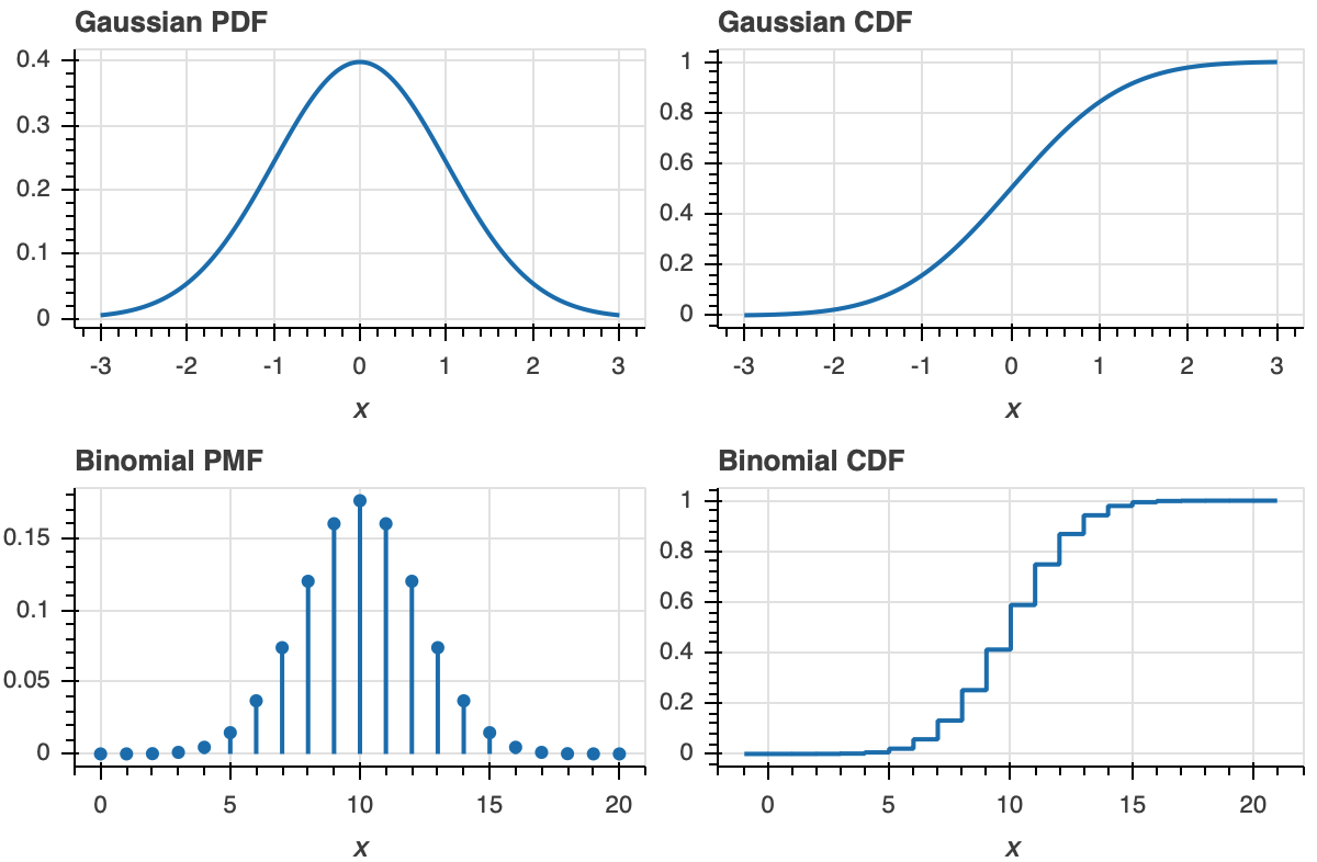
The definition of the ECDF is all that you need for interpretation. For a given value on the x-axis, the value of the ECDF is the fraction of observations that are less than or equal to that value. Once you get used to looking at CDFs, they will become as familiar as PDFs. A peak in a PDF corresponds to an inflection point in a CDF.
To make this more clear, let us look at plot of a PDF and ECDF for familiar distributions, the Gaussian and Binomial.
Now that we know what an ECDF is, we would like to plot it. Unfortunately, HoloViews does not currently natively support plots of ECDFs, but will in the future.
To plot ECDFs, we can use another package, Bokeh-catplot. We will use it here quickly to make a plot of an ECDF, and will expand on its usage in the next notebook in this lesson. To start, we will make an ECDF with our generated Normally distributed data.
[8]:
p = bokeh_catplot.ecdf(
    data=df_norm,
    cats=None,
    val='x'
)

bokeh.io.show(p)
Each dot in the ECDF is a single data point that we measured. Given the above definition of the ECDF, it is defined for all real \(x\). So, formally, the ECDF is a continuous function (with discontinuous derivatives at each data point). So, it should be plotted like a staircase according to the formal definition. We can plot it that way using the style=staircase keyword argument.
[9]:
p = bokeh_catplot.ecdf(
    data=df_norm,
    cats=None,
    val='x',
    style='staircase',
)

bokeh.io.show(p)
Either method of plotting is fine; there is not less information in one than the other.
Let us now plot the percent correct data as an ECDF, both with dots and as a staircase. Visualizing it this way helps highlight the relationship between the dots and the staircase.
[19]:
p = bokeh_catplot.ecdf(
    data=df,
    cats=None,
    val='percent correct',
    style='staircase',
)

p = bokeh_catplot.ecdf(
    data=df,
    cats=None,
    val='percent correct',
    marker='circle',
    marker_kwargs=dict(fill_color='orange', line_color='orange'),
    p=p
)

bokeh.io.show(p)
The circles are on the concave corners of the staircase.
Computing environment
[11]:
%load_ext watermark

%watermark -v -p numpy,pandas,holoviews,bokeh,bokeh_catplot,jupyterlab
CPython 3.7.4
IPython 7.8.0

numpy 1.17.2
pandas 0.24.2
holoviews 1.12.5
bokeh 1.3.4
bokeh_catplot 0.1.3
jupyterlab 1.1.4