Dashboarding
This lesson was written in collaboration with Cecelia Andrews.
[1]:
import os
data_path = "../data/"
import numpy as np
import pandas as pd
import scipy.stats as st
import bebi103
import holoviews as hv
import bokeh.io
import panel as pn
bokeh.io.output_notebook()
pn.extension()
hv.extension('bokeh')
bebi103.hv.set_defaults()
/Users/bois/opt/anaconda3/lib/python3.8/site-packages/arviz/__init__.py:317: UserWarning: Trying to register the cmap 'cet_gray' which already exists.
register_cmap("cet_" + name, cmap=cmap)
/Users/bois/opt/anaconda3/lib/python3.8/site-packages/arviz/__init__.py:317: UserWarning: Trying to register the cmap 'cet_gray_r' which already exists.
register_cmap("cet_" + name, cmap=cmap)


Because it is all about interactive plotting that requires a running Python engine, you really should download this notebook and run it on your machine. Note that Panel will not work on Google Colab as of October 2021.
In this portion of the lesson, we will create a dashboard with real data. A dashboard is a collection of interactive plots and widgets that allow facile graphical exploration of the ins and outs of a data set. If you have a common type of data set, it is a good idea to build a dashboard to automatically load the data set and explore it. Dashboards are also useful in publications, as they allow readers to interact with your result and explore them.
The data set
We will use as data set that comes from the Parker lab at Caltech. They study rove beetles that can infiltrate ant colonies. In one of their experiments, they place a rove beetle and an ant in a circular area and track the movements of the ants. They do this by using a deep learning algorithm to identify the head, thorax, abdomen, and right and left antennae. While deep learning applied to biological images is a beautiful and useful topic, we will not cover it in this course (be on the lookout for future courses that do!). We will instead work with a data set that is the output of the deep learning algorithm.
For the experiment you are considering in this problem, an ant and a beetle were placed in a circular arena and recorded with video at a frame rate of 28 frames per second. The positions of the body parts of the ant were tracked throughout the video recording. You can download the data set here: https://s3.amazonaws.com/bebi103.caltech.edu/data/ant_joint_locations.zip.
To save you from having to unzip and read the comments for the data file, here they are:
# This data set was kindly donated by Julian Wagner from Joe Parker's lab at
# Caltech. In the experiment, an ant and a beetle were placed in a circular
# arena and recorded with video at a frame rate of 28 frames per second.
# The positions of the body parts the ant are tracked throughout the video
# recording.
#
# The experiment aims to distinguish the ant behavior in the presence of
# a beetle from the genus Sceptobius, which secretes a chemical that modifies
# the behavior of the ant, versus in the presence of a beetle from the species
# Dalotia, which does not.
#
# The data set has the following columns.
# frame : frame number from the video acquisition
# beetle_treatment : Either dalotia or sceptobius
# ID : The unique integer identifier of the ant in the experiment
# bodypart : The body part being tracked in the experiment. Possible values
# are head, thorax, abdomen, antenna_left, antenna_right.
# x_coord : x-coordinate of the body part in units of pixels
# y_coord : y-coordinate of the body part in units of pixels
# likelihood : A rating, ranging from zero to one, given by the deep learning
# algorithm that approximately quantifies confidence that the
# body part was correctly identified.
#
# The interpixel distance for this experiment was 0.8 millimeters.
First, we need to load in the data and create columns for the x and y positions in cm and the time in seconds. Note that Pandas’s read_csv() function will automatically load in a zip file, so you do not need to unzip it.
[2]:
# Load data without comments
df = pd.read_csv(os.path.join(data_path, "ant_joint_locations.zip"), comment="#")
interpixel_distance = 0.08 # cm
# Create position columns in units of cm
df["x (cm)"] = df["x_coord"] * interpixel_distance
df["y (cm)"] = df["y_coord"] * interpixel_distance
# Create time column in units of seconds
df["time (sec)"] = df["frame"] / 28
df.head(10)
[2]:
| frame | beetle_treatment | ID | bodypart | x_coord | y_coord | likelihood | x (cm) | y (cm) | time (sec) | |
|---|---|---|---|---|---|---|---|---|---|---|
| 0 | 0 | dalotia | 0 | head | 73.086 | 193.835 | 1.0 | 5.84688 | 15.50680 | 0.000000 |
| 1 | 1 | dalotia | 0 | head | 73.730 | 194.385 | 1.0 | 5.89840 | 15.55080 | 0.035714 |
| 2 | 2 | dalotia | 0 | head | 75.673 | 195.182 | 1.0 | 6.05384 | 15.61456 | 0.071429 |
| 3 | 3 | dalotia | 0 | head | 77.319 | 196.582 | 1.0 | 6.18552 | 15.72656 | 0.107143 |
| 4 | 4 | dalotia | 0 | head | 78.128 | 197.891 | 1.0 | 6.25024 | 15.83128 | 0.142857 |
| 5 | 5 | dalotia | 0 | head | 79.208 | 198.697 | 1.0 | 6.33664 | 15.89576 | 0.178571 |
| 6 | 6 | dalotia | 0 | head | 79.663 | 198.069 | 1.0 | 6.37304 | 15.84552 | 0.214286 |
| 7 | 7 | dalotia | 0 | head | 81.485 | 198.142 | 1.0 | 6.51880 | 15.85136 | 0.250000 |
| 8 | 8 | dalotia | 0 | head | 81.835 | 198.350 | 1.0 | 6.54680 | 15.86800 | 0.285714 |
| 9 | 9 | dalotia | 0 | head | 83.263 | 197.934 | 1.0 | 6.66104 | 15.83472 | 0.321429 |
Sketching your dashboard
At this point, we know what the data set looks like. The first step to creating a good dashboard is to decide what you want to have on it! Think about: What kind of plot(s) should we make to visualize this data? What parameters might we want to change through interactive widgets? What kind of Panel widgets might we use?
I always begin with a hand-drawn sketch for what I want from my dashboard. Below is a reproduction of my first sketch (originally drawn on my whiteboard in collaboration with Cecelia Andrews, one of my former TAs) that I drew on my tablet.
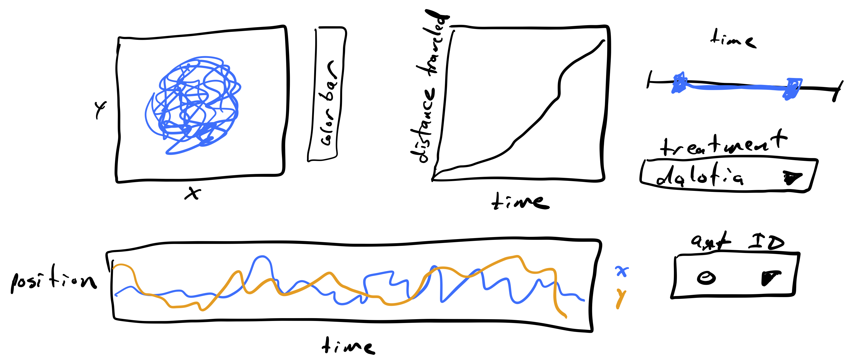
The plot to the upper left is a path with the position of an ant over time. I would like to have the path colored by how much time has passes so we can see time as well. The color of the time is encoded in the colorbar. Next to that plot is a plot of the total distance traveled by the ant over time. I figure this could help visualize when the ant is walking fast and when it is stationary, along with the trajectory plot. At the bottom is another way of visualizing the trajectory of the ant, looking at the x- and y-position over time. To the right are widgets for selecting which to plot. The slider is a range slider, allowing selection of a time range. The range of times of the ant’s trajectory are chosen with this slider. Below that is a selector for which type of beetle is with the ant, either Dalotia or Sceptobius. Finally, there is a selector for the unique ID of the ant being displayed.
We will proceed by building the pieces of the dashboard one at a time to demonstrate how it is done, culminating in the finished dashboard.
Visualizing ant position over time
To visualize the ant’s position over time, we will make a plot using a HoloViews Path element and use color to indicate time. Since we will do this over and over again, we’ll write a function to do this. Such a function, which would be common in a workflow, would be in the package you write to analyze these kinds of data.
[3]:
def extract_sub_df(df, ant_ID, bodypart, time_range):
"""Extract sub data frame for body part of
one ant over a time range."""
inds = (
(df["ID"] == ant_ID)
& (df["bodypart"] == bodypart)
& (df["time (sec)"] >= time_range[0])
& (df["time (sec)"] <= time_range[1])
)
return df.loc[inds, :]
def plot_traj(df, ant_ID, bodypart, time_range=(-np.inf, np.inf)):
"""Plot the trajectory of a single ant over time."""
sub_df = extract_sub_df(df, ant_ID, bodypart, time_range)
return hv.Path(
data=sub_df,
kdims=["x (cm)", "y (cm)"],
vdims=["time (sec)"]
).opts(
color="time (sec)",
colorbar=True,
colorbar_opts={"title": "time (sec)"},
frame_height=200,
frame_width=200,
xlim=(0, 20),
ylim=(0, 20)
)
Let’s use this function to plot the trajectory of the thorax of ant 0, which was treated with a Dalotia beetle to see how it looks.
[4]:
plot_traj(df, 0, "thorax")
[4]:
Building an interaction
Since these trajectories can be long, we may want to be able to select only a portion of the trajectory. To do this, we can use Panel to make a range slider widget to select the interval. Let’s first make the widget.
[5]:
# Create time interval range slider
time_interval_slider = pn.widgets.RangeSlider(
start=df["time (sec)"].min(),
end=df["time (sec)"].max(),
step=1,
value=(df["time (sec)"].min(), df["time (sec)"].max()),
name="time (sec)",
)
# Take a look
time_interval_slider
[5]:
We now want to link this slider to the plot. To do that, we wrap our plotting function in a function that can be under control of the slider. Again, we will do this for ant 0’s thorax.
[6]:
ant_ID = 0
bodypart = 'thorax'
@pn.depends(time_range=time_interval_slider.param.value)
def plot_traj_interactive(time_range):
return plot_traj(df, ant_ID, bodypart, time_range)
We added the pn.depends() decorator to specify that the time range used in plotting the trajectory is linked to the value of the time interval slider. We can now lay out our panel using the pn.Row() and pn.Column() classes.
[7]:
# Set dashboard layout
widgets = pn.Column(pn.Spacer(height=30), time_interval_slider, width=300)
pn.Row(plot_traj_interactive, widgets)
[7]:
(Notice that the slider moves in both renderings in the notebook. Once created, the widgets are all linked.)
Throttling
In the plot above, the plot update lags behind the movement of the interval slider. This is because a lot has to happen to update the plot. A data frame is sliced, and a new plot is created and rendered. This happens very frequently, as Panel attempts to make updates smoothly as you move the slider.
We can instead throttle the response. A callback is a function that is evaluated upon change of a widget. Throttling the callback means that it only gets called upon mouse-up. That is, if we start moving the slider, the plot will not re-render until we are finished moving the slider and release the mouse button.
To enable throttling, we need to construct the interval slider using the value_throttled kwarg, which specifies for which values the throttling is enforced. Then, which using the pn.depends() decorator, we use time_interval_slider.param.value_throttled instead of time_interval_slider.param.value.
Throttling is particularly useful when the callback functions take more than a couple hundred milliseconds to execute, as they do in this case. Let’s remake the dashboard with throttling.
[8]:
# Ranges of times for convenience
start = df["time (sec)"].min()
end = df["time (sec)"].max()
# Create throttled time interval range slider
time_interval_slider = pn.widgets.RangeSlider(
start=start,
end=end,
step=1,
value=(df["time (sec)"].min(), df["time (sec)"].max()),
name="time (sec)",
value_throttled=(start, end),
)
# The plot
@pn.depends(time_range=time_interval_slider.param.value_throttled)
def plot_traj_interactive(time_range):
return plot_traj(df, ant_ID, bodypart, time_range)
# Set dashboard layout
widgets = pn.Column(pn.Spacer(height=30), time_interval_slider, width=300)
pn.Row(plot_traj_interactive, widgets)
[8]:
Speed improvements
As we have just seen, the speed of updating a plot can be a real issue. A major cause of this slowdown is the re-rendering of the plot each time. This is part of the cost of building dashboards with high-level packages like HoloViews (and Panel). To boost speed, we need to drop down a bit and use base Bokeh. In doing so, we can instead only update the underlying data of the plot (instead of re-rendering it) when the time interval slider is adjusted. This is much trickier to implement. Here, we do it generating a Bokeh plot and digging into its column data source. Note that this speed boost would also allow us to interact without throttling.
First, we write a function to generate our trajectory plot using base Bokeh. We use dots instead of a line to make coloring easier (there are some tricks to coloring lines with a quantitative parameter that HoloViews takes care of for us), and we also omit the colorbar to keep the code brief (even though it is already not brief; high level plotting really helps us out!).
[9]:
def plot_traj_bokeh(df, ant_ID, bodypart, time_range=(-np.inf, np.inf)):
"""Make a plot of an ant trajectory."""
sub_df = extract_sub_df(df, ant_ID, bodypart, time_range)
p = bokeh.plotting.figure(
frame_height=200,
frame_width=200,
x_range=[0, 20],
y_range=[0, 20],
x_axis_label="x (cm)",
y_axis_label="y (cm)",
)
# Set up data source; this is what gets changed in the callback
source = bokeh.models.ColumnDataSource(
dict(
x=sub_df["x (cm)"].values,
y=sub_df["y (cm)"].values,
t=sub_df["time (sec)"].values,
)
)
# Mapping of color for glyphs
mapper = bokeh.transform.linear_cmap(
field_name="t",
palette=bokeh.palettes.Viridis256,
low=min(source.data["t"]),
high=max(source.data["t"]),
)
p.circle(source=source, x="x", y="y", color=mapper, size=3, line_alpha=0)
p.toolbar_location = 'above'
return p
# Take a look
p = plot_traj_bokeh(df, 0, "thorax")
bokeh.io.show(p)
So that the slider we use in this aside on speed does not interact with other plots in this notebook, we will make a fresh time interval slider.
[10]:
# Create time interval range slider
time_interval_slider_speed_demo = pn.widgets.RangeSlider(
start=df["time (sec)"].min(),
end=df["time (sec)"].max(),
step=1,
value=(df["time (sec)"].min(), df["time (sec)"].max()),
name="time (sec)",
)
Next, we need to make sure the Bokeh plot is in a pane, so that we can link it to the slider, which we need to do explicitly since we’re updating the data source and not just replotting.
[11]:
p_pane = pn.pane.Bokeh(p)
Next, we need a callback. In our callback, we update the data source, and also the color mapping depending on the value of the range slider. We have to get into the guts of the Bokeh figure, pulling out the glyph renderer and adjusting its properties, including its data source.
[12]:
def time_interval_callback(target, event):
"""Update Bokeh plot data"""
# Extract data for time range
t_range = event.new
inds = (
(df["ID"] == ant_ID)
& (df["bodypart"] == bodypart)
& (df["time (sec)"] >= t_range[0])
& (df["time (sec)"] <= t_range[1])
)
sub_df = df.loc[inds, ["x (cm)", "y (cm)", "time (sec)"]]
# Pull out the glyph rendered from the Panel pane
gr = target.object.renderers[0]
# The new data for the ColumnDataSource
data = dict(
x=sub_df["x (cm)"].values,
y=sub_df["y (cm)"].values,
t=sub_df["time (sec)"].values,
)
# Map the color to the time
mapper = bokeh.transform.linear_cmap(
field_name="t",
palette=bokeh.palettes.Viridis256,
low=min(data["t"]),
high=max(data["t"]),
)
# Update the data source and the glyphs
gr.data_source.update(data=data)
gr.glyph.update(fill_color=mapper)
# Trigger the update
target.param.trigger('object')
Finally, we need to link the slider to the pane with the plot.
[13]:
time_interval_slider_speed_demo.link(p_pane, callbacks={'value': time_interval_callback})
[13]:
Watcher(inst=RangeSlider(end=357.07142857142856, name='time (sec)', step=1, value=(0.0, 357.07142857142856), value_end=357.07142857142856), cls=<class 'panel.widgets.slider.RangeSlider'>, fn=<function Reactive.link.<locals>.link at 0x7fd865712430>, mode='args', onlychanged=True, parameter_names=('value',), what='value', queued=False)
The result that was printed to the screen simply says that we have set up a watcher so that the plot will get updated whenever the slider is changed. Now, we can look at our result!
[14]:
pn.Row(
p_pane,
pn.Spacer(width=15),
pn.Column(pn.Spacer(height=50), time_interval_slider_speed_demo),
)
[14]:
When using this slider, you will note that the plot is much quicker in its response because it is not being rerendered.
Going forward, though, for simplicity and ease of constructing our dashboard, we will not dive into the base Bokeh and will sacrifice the speed of response.
Adding more interactions
We know our data includes multiple ants, multiple body parts, and multiple beetle treatments. Rather than making a new plot for each possible combination, we can add multiple interactive elements to our dashboard. Here, we will add drop-down lists to choose the beetle treatment, ant ID, and body part to track.
Notice that the possible ant IDs change between beetle treatments. For the Dalotia beetle, we have ant IDs 0 - 5. For Sceptobius, we have 6 - 11. So, our Ant ID drop-down list must change when we change the beetle treatment. To do this, we add the helper function update_ant_ID_selector which updates the options in the ant_ID_selector when the beetle treatment is changed. Notice that this function also has the decorator @pn.depends. This tells the function that the ant ID values
it returns should depend on the beetle_selector drop-down list. Additionally, @pn.depends contains the additional kwarg watch=True. This tells the function to listen to the beetle_selector widget and update every time it updates.
[15]:
# Create bodypart selector drop-down list
bodypart_selector = pn.widgets.Select(
name="body part", options=sorted(list(df["bodypart"].unique())), value="thorax"
)
# Create beetle treatment selector drop-down list
beetle_selector = pn.widgets.Select(
name="beetle treatment",
options=sorted(list(df["beetle_treatment"].unique())),
value="dalotia",
)
# Create ant ID selector drop-down list
ant_ID_selector = pn.widgets.Select(
name="Ant ID",
options=sorted(
list(df.loc[df["beetle_treatment"] == df['beetle_treatment'].unique()[0], "ID"].unique())
),
)
# Create helper function to update ant_ID_selector options
# depending on selected beetle treatment
@pn.depends(beetle_selector.param.value, watch=True)
def update_ant_ID_selector(beetle):
inds = df["beetle_treatment"] == beetle
options = sorted(list(df.loc[inds, "ID"].unique()))
ant_ID_selector.options = options
# Create plotting function
@pn.depends(
ant_ID_selector.param.value,
bodypart_selector.param.value,
time_interval_slider.param.value_throttled,
)
def plot_traj_interactive(ant_ID, bodypart, time_range):
return plot_traj(df, ant_ID, bodypart, time_range)
# Set dashboard layout
widgets = pn.Column(
pn.Spacer(height=30),
time_interval_slider,
pn.Spacer(height=15),
beetle_selector,
pn.Spacer(height=15),
pn.Row(ant_ID_selector, bodypart_selector, width=300),
width=300,
)
pn.Row(plot_traj_interactive, pn.Spacer(width=20), widgets)
[15]:
Adding more plots to the dashboard
Let’s try adding another plot to our dashboard. We want to add a plot of the x and y position vs time, plotting x and y as a separate path. First, we will build and test the plotting function to make sure it works.
[16]:
def plot_xy(df, ant_ID, bodypart, time_range=(-np.inf, np.inf)):
"""Plot the x and y positions of a beetle over time."""
sub_df = extract_sub_df(df, ant_ID, bodypart, time_range)
x_plot = (
hv.Curve(data=sub_df, kdims=["time (sec)"], vdims=["x (cm)"], label="x")
.opts(
frame_height=100,
frame_width=500,
color=bebi103.hv.default_categorical_cmap[0],
)
.opts(ylabel="position (cm)")
)
y_plot = (
hv.Curve(data=sub_df, kdims=["time (sec)"], vdims=["y (cm)"], label="y")
.opts(
frame_height=100,
frame_width=500,
color=bebi103.hv.default_categorical_cmap[1],
)
.opts(ylabel="position (cm)")
)
return (x_plot * y_plot).opts(legend_offset=(10, 20))
plot_xy(df, 0, "thorax")
[16]:
Then, we will add our plotting function to our dashboard and use our @pn.depends decorator to link our new plot to our interactive elements. Finally, we have to adjust the dashboard layout to our liking.
[17]:
# Create plotting function for x and y vs time
@pn.depends(
ant_ID_selector.param.value,
bodypart_selector.param.value,
time_interval_slider.param.value_throttled,
)
def plot_xy_interactive(ant_ID, bodypart, time_range):
return plot_xy(df, ant_ID, bodypart, time_range)
# Build the layout of the dashboard
row1 = pn.Row(plot_traj_interactive, widgets)
row2 = pn.Row(plot_xy_interactive)
pn.Column(row1, pn.Spacer(height=15), row2)
[17]:
Looks nice! Let’s add one more plot, one for the cumulative distance traveled by an ant over time. First, we can compute the distance traveled for each ant.
[18]:
def distance_traveled(df):
x_diff = df['x (cm)'].diff()
y_diff = df['y (cm)'].diff()
return np.cumsum(np.sqrt(x_diff**2 + y_diff**2))
df["distance traveled (cm)"] = (
df.groupby(["ID", "bodypart"])
.apply(distance_traveled)
.reset_index(level=["ID", "bodypart"], drop=True)
)
Now we can write a function to make the plot we want and take a look at it. (Again, such a function would be in the package you develop for your analysis pipeline.)
[19]:
def plot_distance_traveled(df, ant_ID, bodypart, time_range=(-np.inf, np.inf)):
"""Make a plot of distance traveled."""
sub_df = extract_sub_df(df, ant_ID, bodypart, time_range)
return hv.Curve(
data=sub_df,
kdims=['time (sec)'],
vdims=['distance traveled (cm)', 'ID', 'bodypart']
).opts(
frame_height=200,
frame_width=200
)
plot_distance_traveled(df, 0, 'thorax')
[19]:
Looks good! Now let’s put on a wrapper and a decorator and add it to our dashboard!
[20]:
@pn.depends(
ant_ID_selector.param.value,
bodypart_selector.param.value,
time_interval_slider.param.value_throttled,
)
def plot_distance_traveled_interactive(ant_ID, bodypart, time_range):
return plot_distance_traveled(df, ant_ID, bodypart, time_range)
row1 = pn.Row(plot_traj_interactive, pn.Spacer(width=20), plot_distance_traveled_interactive)
row2 = pn.Row(plot_xy_interactive)
col1 = pn.Column(row1, pn.Spacer(height=15), row2)
pn.Row(col1, pn.Spacer(width=20), widgets)
[20]:
Looks great! Just what we sketched…. But can you think of improvements you would like to make? Dashboarding is often an iterative process wherein you sketch a dashboard, make it, sketch an improved dashboard, make it, etc.
Computing environment
[21]:
%load_ext watermark
%watermark -v -p numpy,scipy,pandas,bokeh,holoviews,panel,bebi103,jupyterlab
Python implementation: CPython
Python version : 3.8.12
IPython version : 7.27.0
numpy : 1.21.2
scipy : 1.7.1
pandas : 1.3.3
bokeh : 2.3.3
holoviews : 1.14.6
panel : 0.12.1
bebi103 : 0.1.8
jupyterlab: 3.1.7