Model building, start to finish: Traffic jams in ants
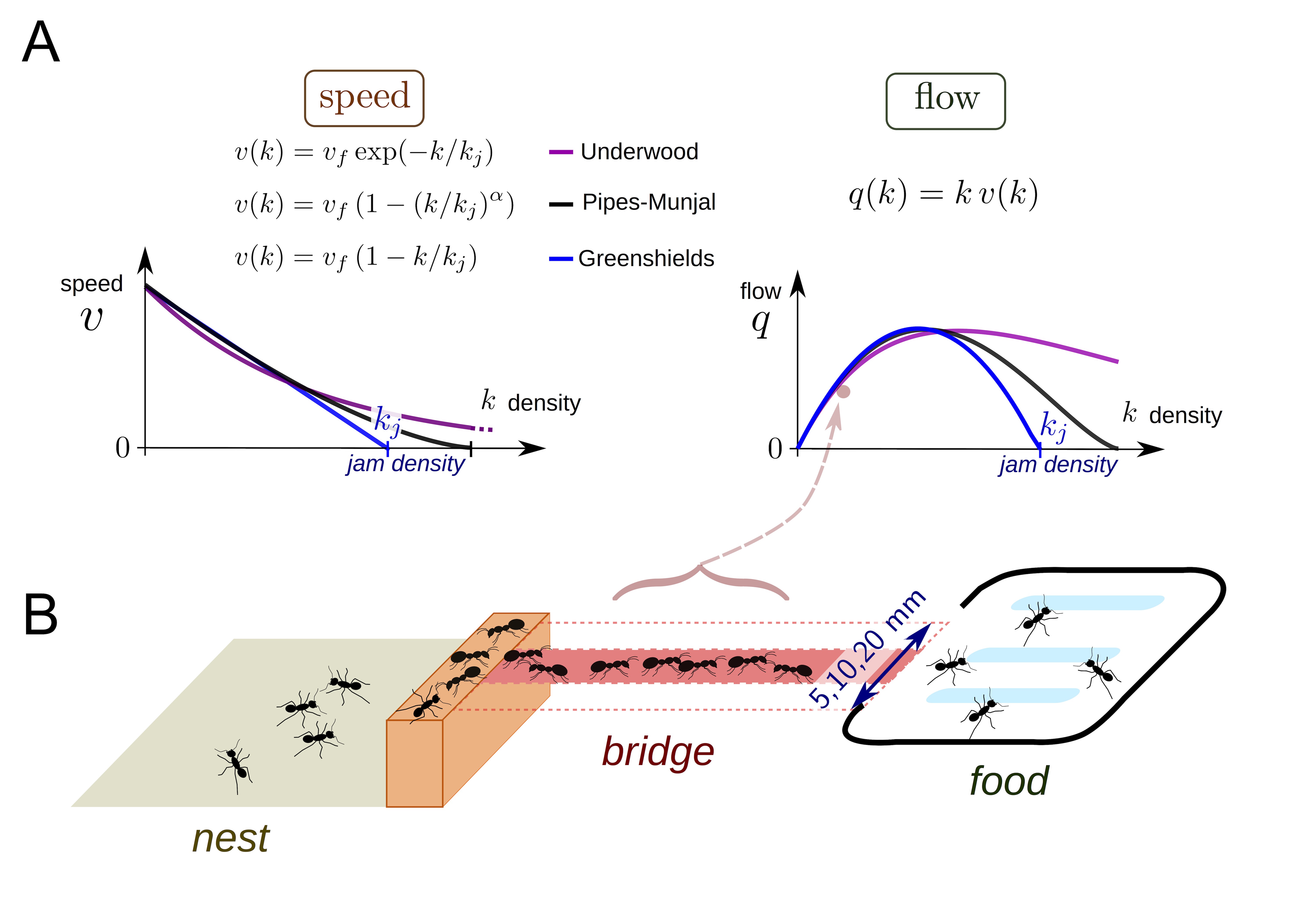
In collective behavior, individual interactors often look out only for their own immediate, short term interest within a crowd. This leads to issues like traffic jams on the road or in crowded pedestrian settings. In general, the flow (speed of moving objects times their density), often increases as density increases until hitting a critical point where the increased density gives rise to a traffic jam and flow begins to decrease. Poissonnier et al. were interested in how ants handle traffic. Unlike human pedestrians or drivers, ants may act more cooperatively in foraging to maximize food acquisition since they share a common goal of raising more young. Today, we will model traffic in ants and see whether they get into jams.
In order to look at ant collective behavior at different densities, the authors starved ant colonies of varying sizes for a few days, and then provided them a foraging object (sugar!) via a bridge of varying width (B). The ants would climb across the bridge to get to the sugar and then return to colony. The variable colony size and bridge width lead to different densities of foraging ants on the bridge, which the authors took (170!) videos of. They measured density and flow across the bridge from the videos. They were interested in how different older models of traffic jams from human behaviors (A) might fit their data and how this might inform whether ants get into traffic while trying to forage.
As this is an eLife paper, the data is (supposed to be) publicly available. There was an issue with the Dryad repository for the data (the DOI link was broken), but the corresponding author very promptly sent me the data when I emailed her. You can download the data set here. We will begin with some exploration for the data before building some models!
[1]:
# Colab setup ------------------
import os, sys, subprocess
if "google.colab" in sys.modules:
    cmd = "pip install --upgrade iqplot colorcet bebi103 arviz cmdstanpy watermark"
    process = subprocess.Popen(cmd.split(), stdout=subprocess.PIPE, stderr=subprocess.PIPE)
    stdout, stderr = process.communicate()
    import cmdstanpy; cmdstanpy.install_cmdstan()
    data_path = "https://s3.amazonaws.com/bebi103.caltech.edu/data/"
else:
    data_path = "../data/"
# ------------------------------

import numpy as np
import pandas as pd

import bebi103

import bokeh
import bokeh.io
import bokeh.util.hex
import iqplot

import cmdstanpy
import arviz as az

import datashader
import holoviews as hv
import holoviews.operation.datashader

bebi103.hv.set_defaults()

bokeh.io.output_notebook()


We will read in the data and take a look at the format.
[2]:
df = pd.read_csv(os.path.join(data_path, "ant_traffic.txt"), delimiter="\t")
df.head()
[2]:
| D | F | |
|---|---|---|
| 0 | 0.5 | 0.5 |
| 1 | 0.5 | 0.0 |
| 2 | 0.5 | 0.0 |
| 3 | 0.5 | 0.0 |
| 4 | 0.5 | 0.0 |
Here, 'D' represents ant density (in \(\mathrm{ant}/\mathrm{cm}^2\), based on the figure in the paper), ant 'F' indicates flow, which is \(\mathrm{ant}/\mathrm{cm}/\mathrm{s}\), also based on the figure. The authors generated a lot of data here (170 hour long videos sampled at 1 Hz \(\approx 600,000\) data points), so we might have a little trouble handling that much data with sampling. They use optimization to get their curve fits, which is a reasonable choice since they are
data rich here. To speed things up for the sake of this exercise, I will thin the data stochastically. This shouldn’t influence the modeling much, and I did some testing and found only quite small differences for the samples of the parameters after thinning the data. We will take a look at the thinned data as compared to the full set to do another sanity check that we aren’t losing too much information. With this many data points, transparency doesn’t always capture the distribution of data
points, since it caps out at fully opaque, so I put a hexplot with a log colormap to get the idea for the data distribution.
[3]:
df_thin = df.sample(n=10000, random_state=24601)

x, y, hex_size = df_thin["D"], df_thin["F"], 0.5

bins = bokeh.util.hex.hexbin(x, y, hex_size)

q = bokeh.plotting.figure(
    match_aspect=True,
    background_fill_color="#440154",
    frame_width=250,
    frame_height=250,
    x_axis_label="Density k (ant/cm^2)",
    y_axis_label="Flow q (ant/cm/s)",
    title="Thinned data",
)
q.grid.visible = False

q.hex_tile(
    q="q",
    r="r",
    size=hex_size,
    line_color=None,
    source=bins,
    fill_color=bokeh.transform.log_cmap(
        "counts", "Viridis256", min(bins.counts), max(bins.counts)
    ),
)

color_bar = bokeh.models.ColorBar(
    color_mapper=bokeh.transform.log_cmap(
        "counts", "Viridis256", 0.0001, max(bins.counts)
    )["transform"],
    ticker=bokeh.models.LogTicker(),
    border_line_color=None,
    width=30,
    location=(0, 0),
    label_standoff=12,
)

q.add_layout(color_bar, "right")


x, y, hex_size = df["D"], df["F"], 0.5

bins = bokeh.util.hex.hexbin(x, y, hex_size)

r = bokeh.plotting.figure(
    match_aspect=True,
    background_fill_color="#440154",
    frame_width=250,
    frame_height=250,
    x_axis_label="Density k (ant/cm^2)",
    y_axis_label="Flow q (ant/cm/s)",
    title="All data",
)
r.grid.visible = False

r.hex_tile(
    q="q",
    r="r",
    size=hex_size,
    line_color=None,
    source=bins,
    fill_color=bokeh.transform.log_cmap(
        "counts", "Viridis256", min(bins.counts), max(bins.counts)
    ),
)

color_bar = bokeh.models.ColorBar(
    color_mapper=bokeh.transform.log_cmap(
        "counts", "Viridis256", 0.0001, max(bins.counts)
    )["transform"],
    ticker=bokeh.models.LogTicker(),
    border_line_color=None,
    width=30,
    location=(0, 0),
    label_standoff=12,
)

r.add_layout(color_bar, "right")

bokeh.io.show(bokeh.layouts.gridplot([q, r], ncols=2))
Another approach to look at large data sets is to use datashader. Datashader tends to do a better job showing rare or low density points even when they are outnumbered by other values.
[4]:
points = hv.Points(data=df, kdims=["D", "F"],)

hv.extension("bokeh")

# Datashade with spreading of points
hv.operation.datashader.dynspread(
    hv.operation.datashader.datashade(points, cmap=list(bokeh.palettes.Viridis10),)
).opts(
    frame_width=350,
    frame_height=300,
    padding=0.05,
    show_grid=False,
    bgcolor="white",
    xlabel="Density k (ant/cm^2)",
    ylabel="Flow q (ant/cm/s)",
    title="All data",
)
Data type cannot be displayed:
[4]:
The thinning looks pretty reasonable. Keep in mind that the colormap is on a log scale, so the amount of weight that the far densities will get to influence the posterior is almost negligible compared to the densities below ~8. The authors also do a fit on the average of the flow at each density in order to increase the weight of the points on the high density portion of the graph. We can also plot that here. We use the full data set to get the mean, and also plot the 2.5-97.5 percentiles for the data, calculated directly based on the full dataset. In addition, we make a plot to look at how many measurements the authors recorded at different ant densities.
[5]:
df_lower, df_mean, df_upper, df_counts = (
    df.groupby("D").quantile(0.025).reset_index(),
    df.groupby("D").mean().reset_index(),
    df.groupby("D").quantile(0.975).reset_index(),
    df.groupby("D").count().reset_index(),
)

p = bokeh.plotting.figure(
    frame_width=500,
    frame_height=300,
    x_axis_label="Density k (ant/cm^2)",
    y_axis_label="Mean flow q (ant/cm/s)",
    title="Mean flow at various ant densities",
)

for d, lb, ub in zip(df_lower["D"].values, df_lower["F"].values, df_upper["F"].values):
    p.line([d, d], [lb, ub], line_width=2)
p.circle("D", "F", source=df_mean, alpha=0.75, size=11)

q = bokeh.plotting.figure(
    frame_width=500,
    frame_height=300,
    x_axis_label="Density k (ant/cm^2)",
    y_axis_label="Number of observations",
    y_axis_type="log",
    title="Number of observations of ants taking on a given density on the bridge",
)

q.circle("D", "F", source=df_counts, alpha=1, size=9)

bokeh.io.show(bokeh.layouts.gridplot([p, q], ncols=2))
It looks like the data is pretty linear in the early part of the regime, before the data becomes both much more sparse and may plateau. In order to try to get a model for ant traffic at these variable densities, the authors pulled several models from the literature. They start off with a parabolic shaped model (which makes sense for traffic, at some high density you start to get jammed up and are not able to increase flow, but instead it starts to reduce), an exponential, a modified parabola with an additional shape parameter \(\alpha\), and their own two-phase flow, which describes the data as a piecewise linear relationship with a linearly increasing portion which goes to a flat line at some density. Here are the mathematical models:
Greenshields:
Underwood:
Pipes-Munjal:
Two-phase flow:
- :nbsphinx-math:`begin{align}
- q(k) = left{
- begin{array}{lr}
k cdot v &mathrm{if} , k leq k_j\ k_j cdot v &mathrm{if} , k > k_j
end{array}
right.
end{align}`
For these equations, \(q\) is the flow, \(k\) is the density, \(k_j\) is the sort of threshold after which either jamming or plateauing of flow increase occurs, \(v_f\) is the free speed of interactors without contact, \(\alpha\) defines how fast the flow decays after threshold. With these in hand, we can begin to define a statistical model for our data generating process. This is where you come in! The best way to get comfortable modeling is to do it. Pick one or multiple mathematical models from above and construct a statistical model from it. Code that up in Stan and get samples! For your model, then fit the thinned data set and the averaged data set and make some comparisons of the results. For the sake of time, I have included code from Justin to plot the results once you write down your model and code it in Stan.
To decide on priors for some of these quantities, it may be usefult to take a look at what a set of ants looks like when sitting on a 20mm bridge, or to look up the size of an Argentine ant, Linepithema humile, the all too common invasive ant all over LA. Here are ants on a 20mm wide bridge:
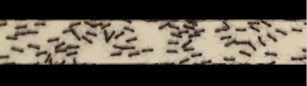
This image was taken from a video of the experiment used to generate the density data we are analyzing today, which can be found here.
This is where you come in! The best way to get comfortable modeling is to do it.
Pick one or multiple mathematical models from above and construct a statistical model from it.
Write down the statistical model with \(\sim\) notation, as this almost gives you the Stan code. Code that up in Stan and get samples! For your model, then fit the thinned data set and the averaged data set and make some comparisons of the results. For the sake of time, I have included code from Justin to plot the results once you write down your model and code it in Stan.
Write out your statistical model here!
STATISTICAL MODEL
With the statistical model in hand, we can do a prior predictive check to see whether the statistical model we have chosen seems reasonable.
Code up your prior predictive check in Stan!
PRIOR PREDICTIVE STAN CODE
Skeleton code:
functions {

}

data {
  int<lower=1> N;
  real k[N];

}

generated quantities {
  // Data
  real q[N];


  for (i in 1:N) {
    q[i] = ################;
  }
}
I assume here that you will code the prior predictive such that you will pass the numbers that you choose to parameterize your priors in as data for the sampling. This is convenient because you will not need to recompile the code if you decide to change the shape of one of your priors. I also assume that the samples from the prior predictive are called ‘q’.
[ ]:
sm_prior_pred = cmdstanpy.CmdStanModel(
    stan_file="ant_traffic_prior_predictive.stan"
)
With the code ready for the prior predictive checks, you are ready to sample!
[ ]:
k = df_thin['D'].values

k = np.linspace(0, k.max(), 2000)

data = {
    "N": len(k),
    "k": k,
    ## INSERT THE CONSTANTS FOR YOUR PRIOR DISTRIBUTIONS HERE!!
}

samples = sm_prior_pred.sample(data=data, iter_sampling=1000, fixed_param=True)
Now we parse the data for our plots.
[ ]:
samples = az.from_cmdstanpy(posterior=samples, prior=samples, prior_predictive=['q'])
We will use a predictive regression here to get a sense of how we did.
[ ]:
bokeh.io.show(
    bebi103.viz.predictive_regression(
        samples.prior_predictive['q'],
        samples_x=k,
        percentiles=[30, 60, 90, 99],
        x_axis_label='density',
        y_axis_label='flow rate',
    )
)
Now we are ready to code the model in Stan!
STAN CODE FOR MODEL
Skeleton code:
functions {

}

data {
  int<lower=1> N;
  int N_ppc;
  real k[N];
  real q[N];
  real k_ppc[N_ppc];

}

parameters {

}

transformed parameters {

}

model {

  q ~ ############;
}


generated quantities {
  real q_ppc[N_ppc];

  for (i in 1:N_ppc) {
      q_ppc[i] = ###########;
    }
}
We can now prepare a dictionary with the data, and draw samples. Here is preparation for the data. Make sure that you either change these variable names or use the same variable names as here in your Stan code!
[ ]:
k = df_thin['D'].values
q = df_thin['F'].values

#k = df_mean['D'].values
#q = df_mean['F'].values

N_ppc = 200
k_ppc = np.linspace(0, k.max(), N_ppc)
data = {
    "N": len(k),
    "k": k,
    "q": q,
    "N_ppc": N_ppc,
    "k_ppc": k_ppc,
}
With the data ready, we can now sample!
[ ]:
sm = cmdstanpy.CmdStanModel(stan_file='ant_traffic_model.stan')

samples = sm.sample(data=data, sampling_iters=1000, chains=4)

samples = az.from_cmdstanpy(posterior=samples, posterior_predictive=["q_ppc"])
Use this code to look at the corner plot (change variable names as needed!)
[ ]:
bokeh.io.show(
    bebi103.viz.corner(
        samples, pars=["k_j", "v_f", "sigma"], xtick_label_orientation=np.pi / 4
    )
)
Use this code to loot at the posterior predictive check samples (change variable names as needed!)
[ ]:
q_ppc = samples.posterior_predictive['q_ppc'].stack(
    {"sample": ("chain", "draw")}
).transpose("sample", "q_ppc_dim_0")

bokeh.io.show(
    bebi103.viz.predictive_regression(
        q_ppc,
        samples_x=k_ppc,
        percentiles=[30, 50, 70, 99],
        data=np.vstack((k, q)).transpose(),
        x_axis_label='ant density, k [ant/cm^2]',
        y_axis_label='ant flow, q [ant/cm/s]',
        x_range=[0, k.max()],
    )
)
Use this code to look at the parallel coordinate plot for diagnostics on the samples (change variable names as needed!)
[ ]:
bokeh.io.show(
    bebi103.viz.parcoord_plot(
        samples,
        transformation="minmax",
        pars=["k_j", "v_f", "sigma"],
    )
)
Computing environment
[ ]:
%load_ext watermark
%watermark -v -p numpy,pandas,cmdstanpy,arviz,bokeh,bebi103,iqplot,jupyterlab,datashader
bebi103.stan.clean_cmdstan()